
Which version do you prefer?
In this project Yoojin redesigned Grammarly's weekly newsletter
to make it more comprehensive and emotionally engaging.
to make it more comprehensive and emotionally engaging.
INTRODUCTION
Grammarly applies Artificial Intelligence and Machine Learning to help people to improve their writing performance by providing instant and convenient proofreading services. This is a bootcamp project studying weekly Newsletters of the company, the project was conducted under the supervision of a senior UX researcher.
Goal
The main goal of this project is evaluation of the existing newsletter, researching users and proposing ideas to improve User Experience of the Newsletters.
Scope
The scope of the project is the weekly Newsletter sent by Grammarly informing its users about their writing performance measured by Grammarly application. The target user segment are the users of the free plan of Grammarly who are the potential users of the premium plan(personal paid plan).
Approach & Deliverables
Yoojin approached the project with the Design Thinking process introduced by d.school.
· Empathize: User interview, product research
· Test: User test, A/B testing
· Define: "How might we" definition
· Ideate: Brainstorming, design directions
· Prototyping: Wireframes, high-fidelity prototype
· Empathize: User interview, product research
· Test: User test, A/B testing
· Define: "How might we" definition
· Ideate: Brainstorming, design directions
· Prototyping: Wireframes, high-fidelity prototype
Newsletter from UX perspective
The main content of the weekly Newsletter is the report of the user's performance in writing. Visualizing the performance helps users to feel the usefulness of the product. Also, it makes users feel better about themselves by seeing how productive and accurate they are.
Direct Touchpoint
Yoojin considered that Newsletter plays an especially important role for Grammarly since the existence of the product is not prominent while using it. The interaction with the product is very seamless, it tries not to interrupt users from their main task which is writing. Because proofreading is not the main task for users but supplementary. On the contrary, while reading the Newsletter user's main task is reading it, so it's the touchpoint when the user encounters the product face-to-face. It could be compared with the reporting of a secretary to the manager. And at this touchpoint, the product can build personal relationships - emotional bonds with users.
Yoojin considered that Newsletter plays an especially important role for Grammarly since the existence of the product is not prominent while using it. The interaction with the product is very seamless, it tries not to interrupt users from their main task which is writing. Because proofreading is not the main task for users but supplementary. On the contrary, while reading the Newsletter user's main task is reading it, so it's the touchpoint when the user encounters the product face-to-face. It could be compared with the reporting of a secretary to the manager. And at this touchpoint, the product can build personal relationships - emotional bonds with users.

Empathizing with users & the product
User Interview
Yoojin conducted a semi-structured interview with 7 people. The goal of the interview was to understand their contexts of written communication and proofreading methods.
Contexts of written communication:
· e-mail communication at work
· writing papers in an academic context
· SNS activity
· chatting with close people
· job application
· e-mail communication at work
· writing papers in an academic context
· SNS activity
· chatting with close people
· job application
Proofreading methods:
· Self-proofreading(reading the text again)
· Asking family, friends, close people
· Using applications/websites(Google Translator, Grammarly)
· Self-proofreading(reading the text again)
· Asking family, friends, close people
· Using applications/websites(Google Translator, Grammarly)
None of the users had an experience of using professional proofreading service before.
Product Research
Basing on the contexts of the written communications and proofreading methods discovered in the interview, Yoojin did further analysis to spot the niche of Grammarly.
AI proofreading VS human proofreading
Yoojin made a comparison of AI proofreading with human proofreading by different criteria in order to understand its pros and cons. As is seen in the comparison table below, AI proofreading has advantages over human proofreading in regard to proofreading speed and cost.
Yoojin made a comparison of AI proofreading with human proofreading by different criteria in order to understand its pros and cons. As is seen in the comparison table below, AI proofreading has advantages over human proofreading in regard to proofreading speed and cost.

Understanding the context of the use
To identify in what context Grammarly could have the highest usefulness Yoojin mapped the writing contexts mentioned on the user interview by different criteria.
To identify in what context Grammarly could have the highest usefulness Yoojin mapped the writing contexts mentioned on the user interview by different criteria.
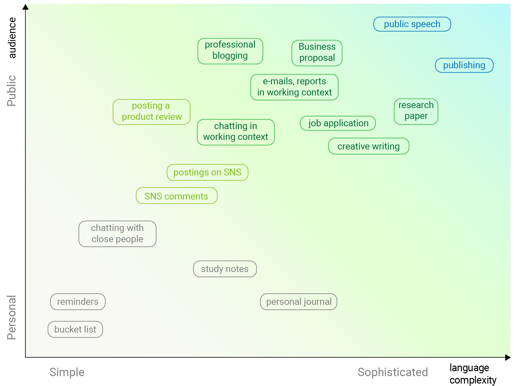
Texts with higher language complexity and larger audience have higher need in proofreading.

AI proofreading method has advantages over human proofreading with shorter writing time and larger text volumes
The diagram shows clearly that the proofreading is most needed for complex texts addressed to a large audience. And with its speed and cost advantages, Grammarly is suitable for routine written communications with the comparably large audience such as e-mail communication in the working context, self-employed written-content creators and scholars writing research papers.
User Testing
Yoojin conducted 5 unmoderated User Testings using USERBRAIN. The purpose of the testing was to understand users' experience, especially their emotional engagement with the Newsletter.Target group: Users speaking English
Total interviewed: 5 people
Test Feedback
Fact-based report. Many users mentioned that the Newsletter shows real numbers. It made them feel that the report is trustworthy and useful.
Irrelevant or hard for comprehension. But users found it hard to interprete the presented figures to say whether it's good or bad or how much good or bad. Also, users felt that the information is irrelevant to them by mentioning that this report will be useful for some people who are interested in their writing.
Need for personalized insights. Many users wanted to see the actual mistakes that they have made. The information of the quantity and the types of mistakes the users had made didn't impose much useful to users.
The Take-Away
- There is a need for a more personalized approach to the report.
- The report should be more emotional and comprehensive.
Defining the problem
"How might we make the newsletter more
comprehensive and emotionally engaging?"
comprehensive and emotionally engaging?"
Ideation
Reflective level of design
In the light of Don A. Norman's concept of three levels of design Yoojin defined that the essential role of the Newsletter is to build a long-term relationship with customers, hence he focused on the reflective level of design. The reflective level of design is responsible for reflecting users' self-image and creating the message the product imposes. Hence the Newsletter must support users' desirable self-image.
Brainstorming
What are users' KPI?
Yoojin conducted brainstorming and derived key values(self-images) that users might seek in Grammarly:
<Self-Images>
· Smart, Accurate, Effective
· Influential, Persuasive
<Desires>
· Attention, Respect
· Impact, Change
Relationship between user and Grammarly
Taking into account the derived self-images Yoojin searched suitable types of relationships between users and Grammarly and the image of the product to support that:
<User-Grammarly Relationship>
· Assistant, Coordinator, Advisor
· Handful tool(ex: sharpener, lantern)
· Undercover, Messenger
<Grammarly Image>
· Trustworthy, Smart
· Supportive, Encouraging
· "Personally" fond in user
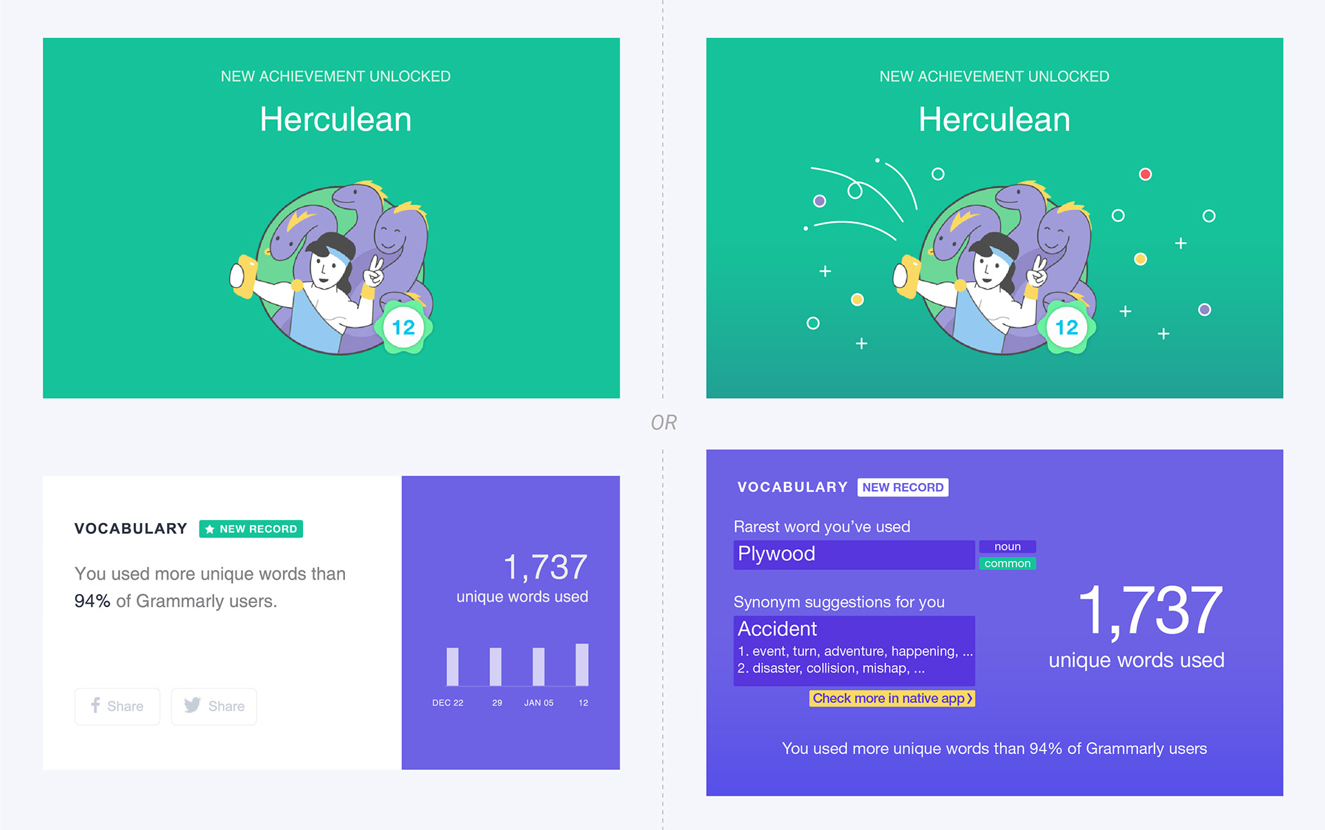
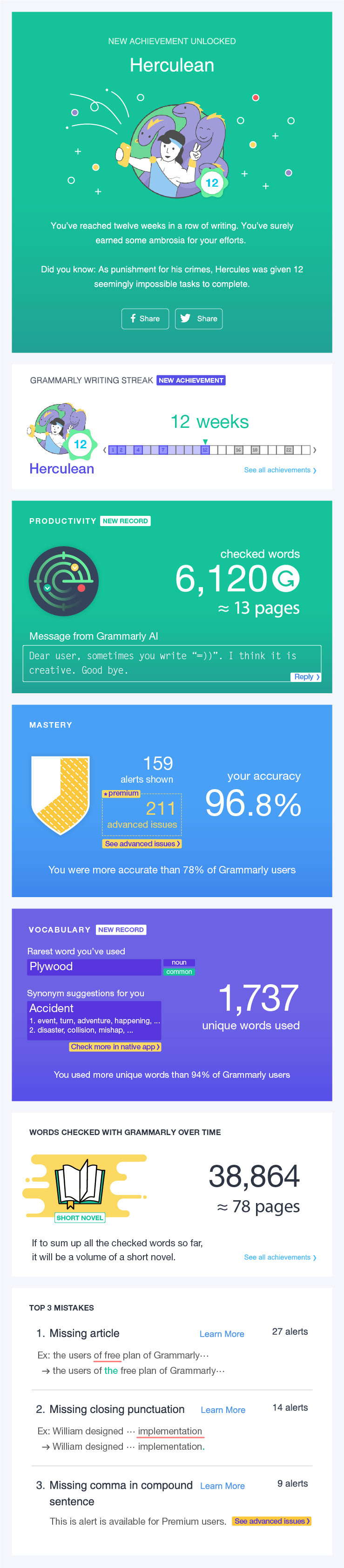
Design directions
Based on the produced ideas, Yoojin made directions for information and visual design to enhance the Newsletter's reflective level of design. Visual design corrections have been made in accordance with the existing visual identity.
Information Layout
· Comprehensive for skimming
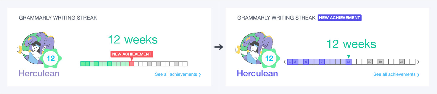
- One main figure for each insight
- Converting a number of words into the number of pages
- One main figure for each insight
- Converting a number of words into the number of pages
· Useful and interesting insights if to look into
- More empathetic insights: rarest words used, synonym suggestions
- Comparison of free and premium versions in one page
- More empathetic insights: rarest words used, synonym suggestions
- Comparison of free and premium versions in one page
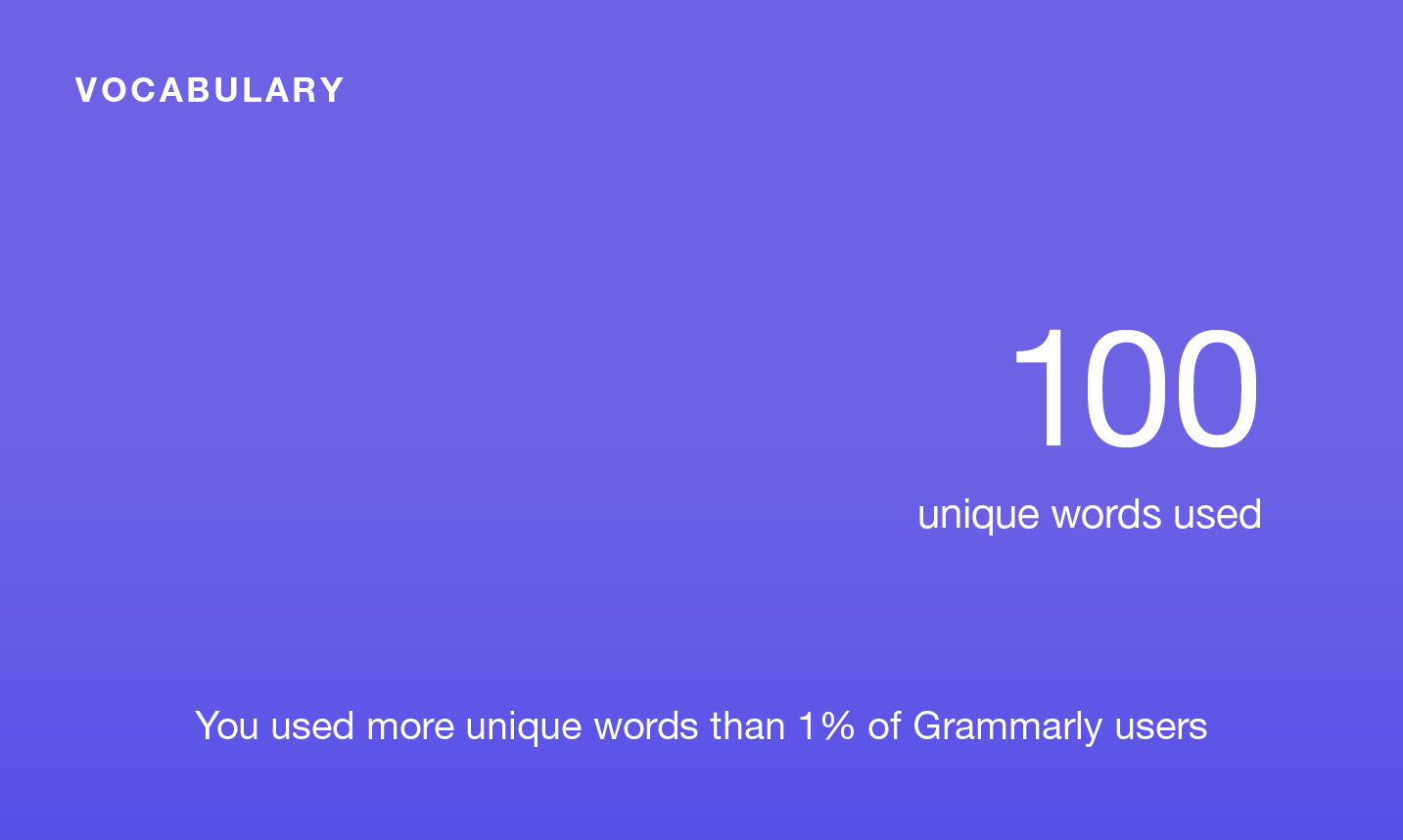
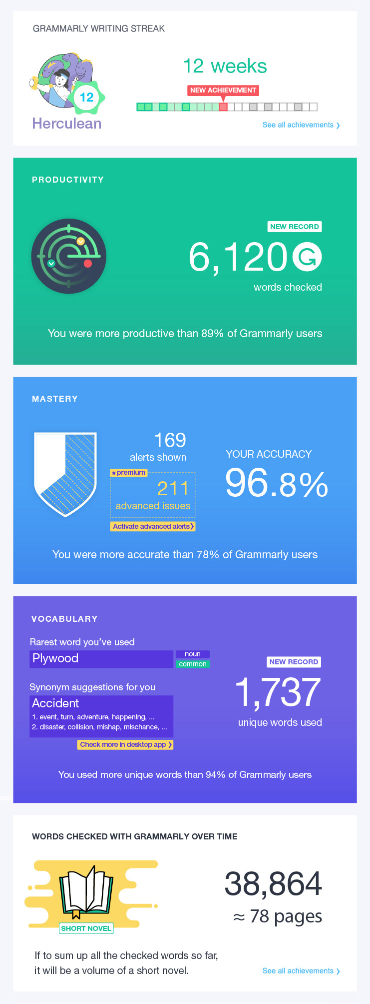
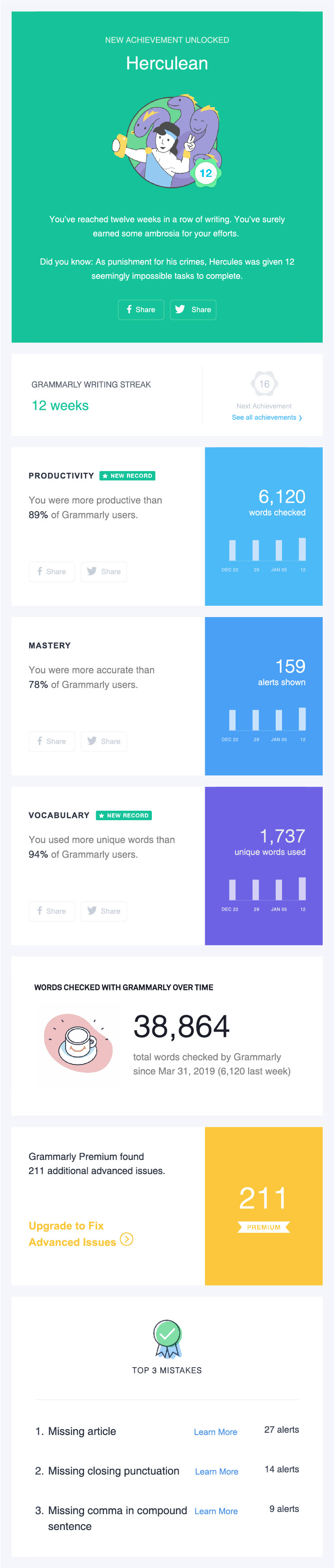
Original Layout
New Layout(wireframe)

Visual Guidelines
· Emotional enhancement
- Connecting Grammarly with positive emotions
- Connecting error detection with a sense of ease from problems
- Connecting Grammarly with positive emotions
- Connecting error detection with a sense of ease from problems
· Enhancing smart, intelligent mood
- Emotional enhancement: using comprehensive graphics

- Smart and intelligent mood: adding depth to colors
- Emotional enhancement: adding Grammarly icon after the number of checked words
- Emotional enhancement: adding Grammarly icon after the number of checked words

PROTOTYPING & TESTING
High-fidelity Prototype & user testing
Yoojin designed a high-fidelity prototype and conducted user testing to check its improvement. In order to minimize biases of results between two versions, Yoojin conducted A/B testing with users from the same target group.
Target group: University students speaking English.
Location: C. University library building.
Total interviewed: 6(3-A, 3-B)
Facilitation: Yoojin conducted tests for two versions separately; the testers evaluated only one version of the Newsletter.
Approach:
At first, the testers freely skimmed through the Newsletter and gave their opinion. After, the facilitator asked them to check each part of the report and give comments on them if they are useful, interesting.
At first, the testers freely skimmed through the Newsletter and gave their opinion. After, the facilitator asked them to check each part of the report and give comments on them if they are useful, interesting.
Test Results
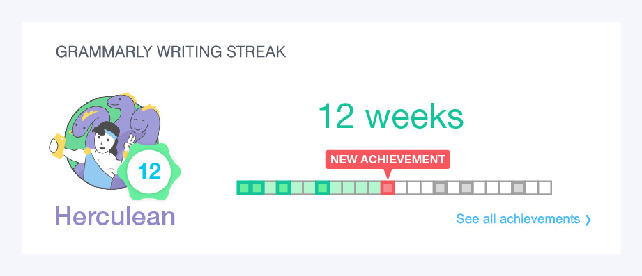
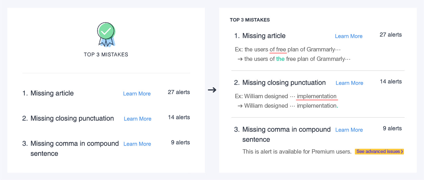
The test results revealed that there are improvements in comprehension of the figures in the report; users didn't make the same questions about the meaning of the figures. It also revealed some issues of the redesigned version, mainly related to the lack of clarity of the developed infographics.Though it was hard to measure the improvement in emotional involvement as it was qualitative testing, some users had better feedback on the 'Vocabulary' and 'Words checked over time' sections.

Incorporating the feedback
Clarifying infographics
Personalizing insights
Final Design and further steps
After a series of iterations, Yoojin completed the final redesigned version of the Newsletter. The prototypes are accessible through the links below.
Original Newsletter(fragment)
Redesigned Newsletter
Further Steps
Evaluation of Emotional engagement
To evaluate the improvement of the emotional engagement, which is important for building long-term relationships with customers, Yoojin suggests conducting a quantitative test by surveying users to get their opinion if the Newsletter is interesting, useful. The sample survey for A/B testing is available through the links below.
To evaluate the improvement of the emotional engagement, which is important for building long-term relationships with customers, Yoojin suggests conducting a quantitative test by surveying users to get their opinion if the Newsletter is interesting, useful. The sample survey for A/B testing is available through the links below.
Evaluation of KPI
Yoojin suggests conducting A/B testing by distributing different versions of Newsletters for a period of time and compare conversion rates. The criteria for comparison would be a subscription to the Premium plan and installation of native desktop apps.
Yoojin suggests conducting A/B testing by distributing different versions of Newsletters for a period of time and compare conversion rates. The criteria for comparison would be a subscription to the Premium plan and installation of native desktop apps.